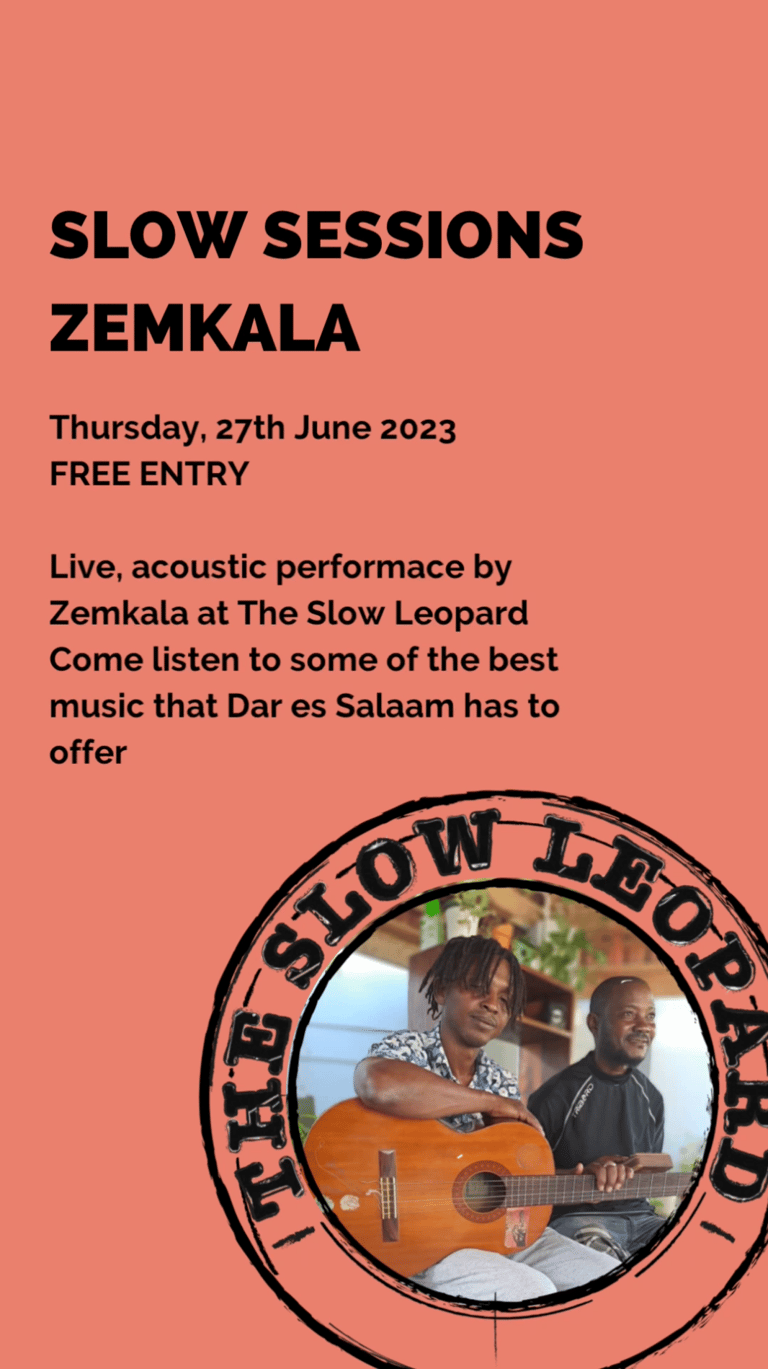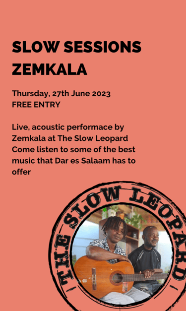
The Slow Leopard
I developed visual identities that reflect the heart and purpose of each brand. One of my projects was creating the corporate identity for a hostel in Tanzania, where I worked to capture the essence of its vibrant, welcoming atmosphere.
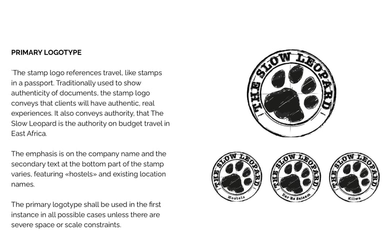
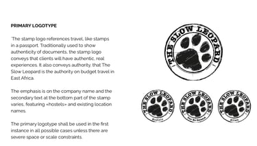
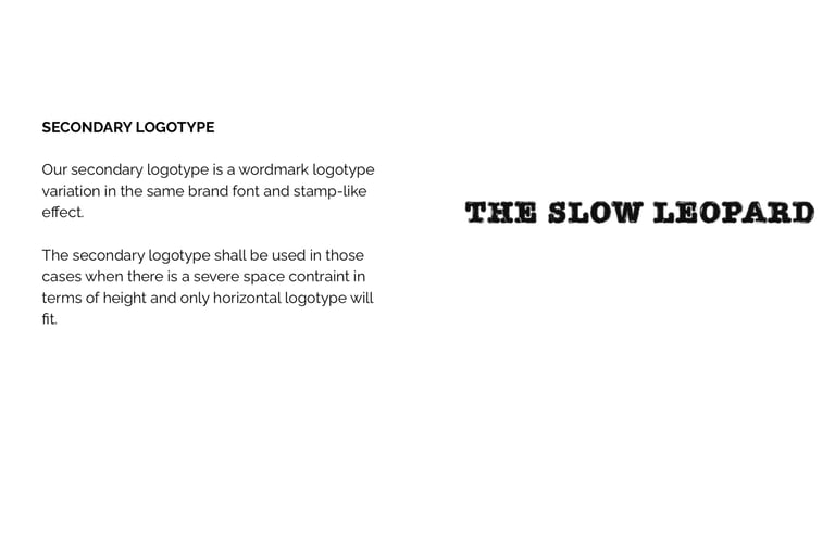
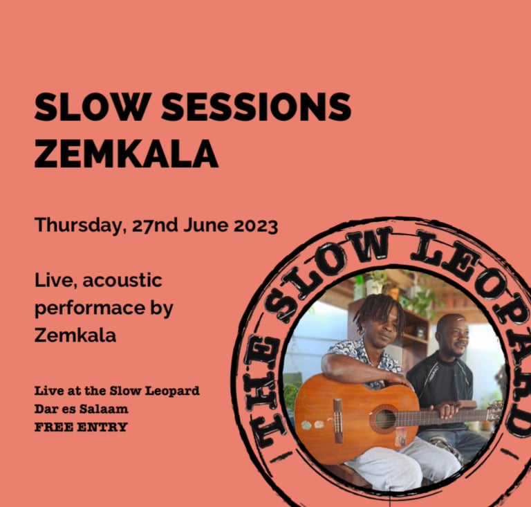
For this project, I designed a stamp logo that references travel, much like stamps in a passport. Traditionally used to authenticate documents, the stamp logo conveys that guests will have authentic, real experiences. It also positions The Slow Leopard as an authority on budget travel in East Africa, while the leopard pawprint subtly connects the logo to the hostel’s name.
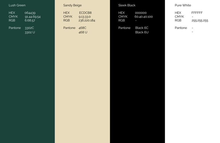
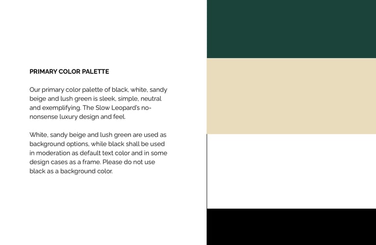
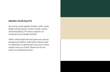
The primary color palette, black, white, sandy beige, and lush green, is sleek, simple, and neutral, reflecting the hostel’s no-nonsense design. White, sandy beige, and lush green are used as background options, while black is reserved for text and framing in select design elements.
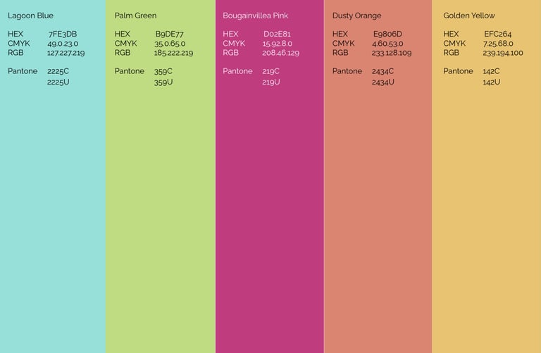
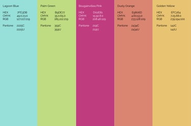
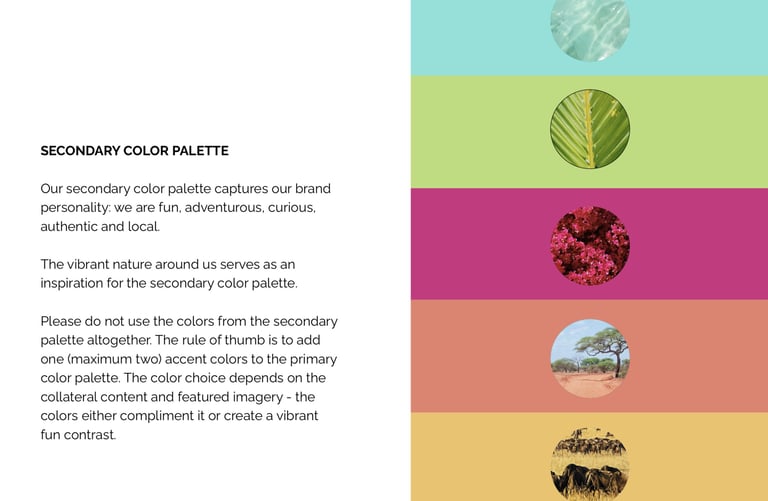
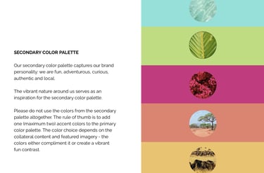
The secondary color palette captures the brand’s fun, adventurous, and authentic personality, inspired by the vibrant natural surroundings. Accent colors from this palette are used sparingly to complement imagery or create a bold, playful contrast, ensuring the identity stays consistent while feeling lively and engaging.