Logo´s
This page showcases a selection of logos I’ve designed for brands, projects, and collaborations. Each logo is created with a strong focus on clarity, concept, and visual identity tailored to reflect the personality and purpose behind every brand. From playful concepts to clean and minimal marks, this collection highlights my approach to thoughtful, versatile logo design.
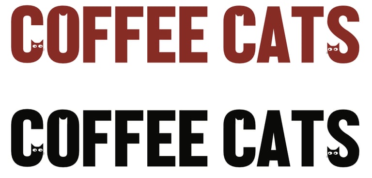
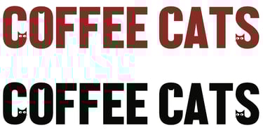
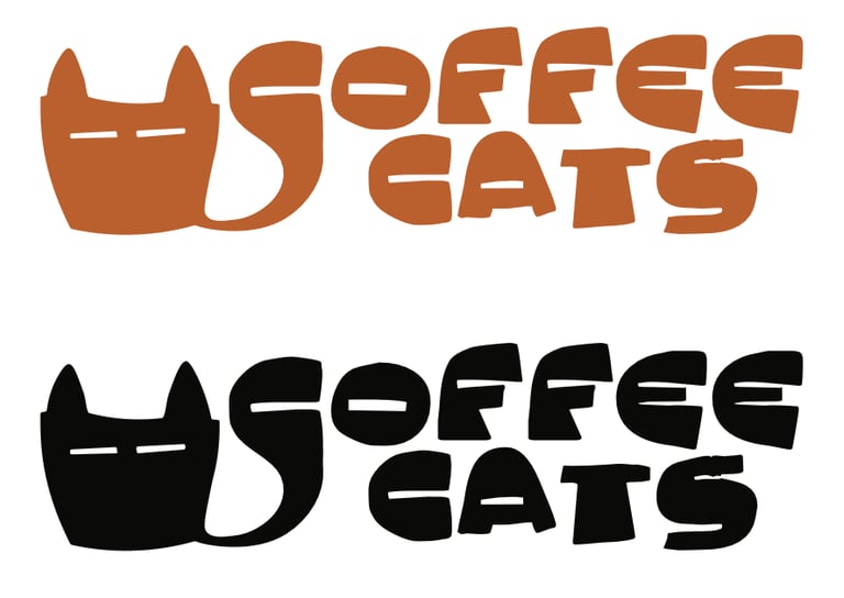
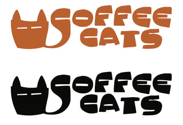


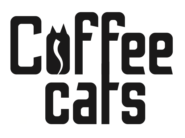

For the Coffee Cats brand, I designed three different typographic logo concepts, each combining the elements of coffee and cats in a unique and playful way. Using details like cat ears, coffee cups, and coffee beans, the logos explore different levels of character, from fun and charming to more clean and café-appropriate. This range allowed me to balance personality with professionalism, creating visual directions that feel welcoming, memorable, and perfectly suited for a cozy café environment.
Coffee Cats Cafe
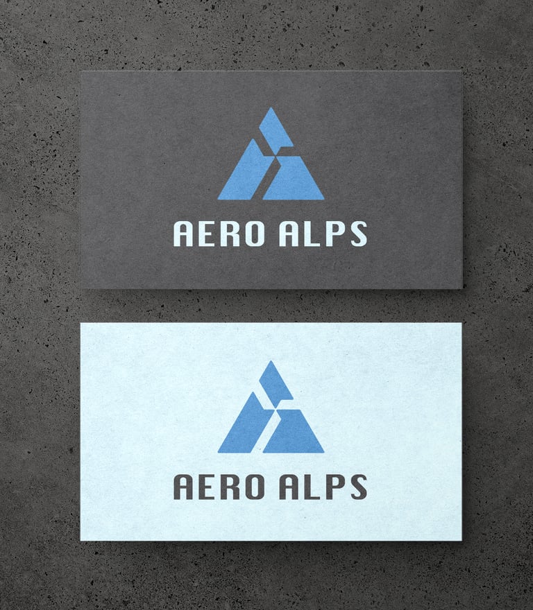
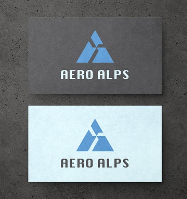
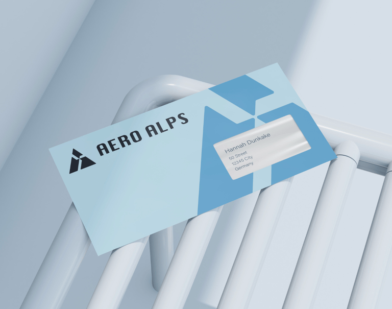
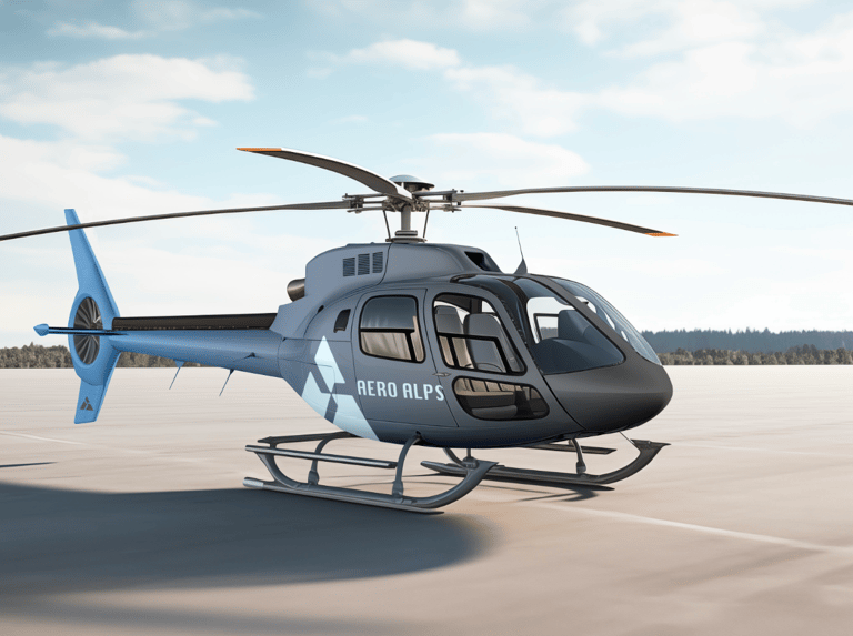
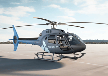
Aero Alps
Aero Alps is a heliskiing company, and the logo is inspired by both the shape of a mountain and the rotor blades of a helicopter, perfectly capturing what the brand is about. I chose a clean, minimalistic aesthetic to keep the identity professional, trustworthy, and visually strong. The color palette combines light blue and a deeper, stronger blue, reflecting snow, altitude, and elegance while maintaining a clear sense of reliability and professionalism.
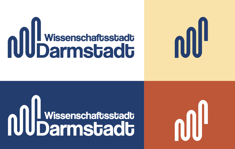
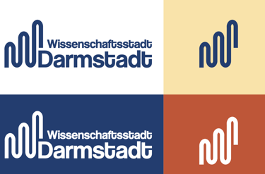
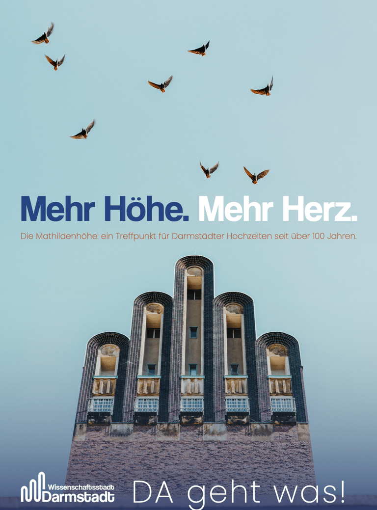
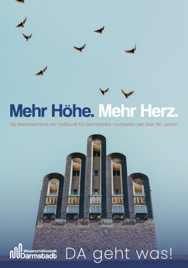
Darmstadt rebranding
For the rebranding of the City of Darmstadt, I decided to preserve the Five-Finger Tower, an important symbol and a core part of the city’s identity. Instead of replacing it, I reimagined it in a more abstract, contemporary form and matched the typography to the new visual style. Since Darmstadt is also a university city, I wanted the design to carry a more modern, youthful energy while still respecting its traditions.
For the color palette, I stayed close to the city’s roots. The blue of the local football team, a strong source of pride, paired with a Tones inspired by elements from historic buildings. Together, these choices create a balance of heritage, authenticity, and forward thinking design.
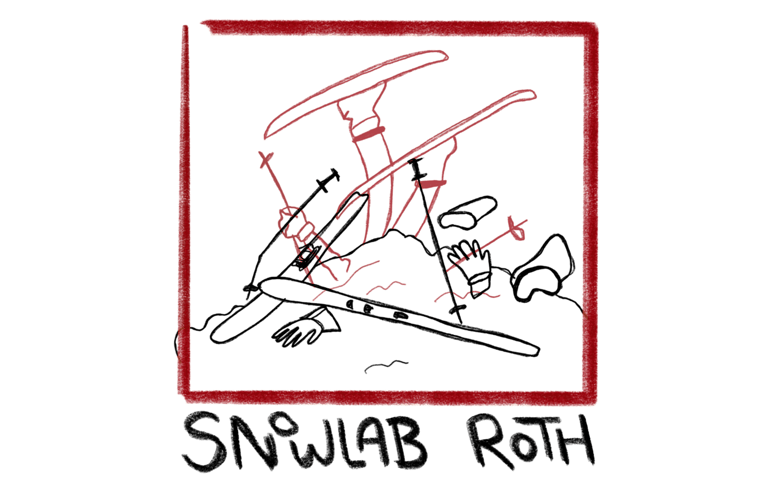
Snowlab Roth
For Snowlab Roth, a ski and snowboard service, I created a playful, sketch style logo that reflects the brand’s youthful, energetic customer base. The hand drawn look captures the fun, relaxed spirit of the local ski community and fits perfectly with the larger friend groups and young riders who make up the core demographic. The result is a lighthearted yet recognizable visual identity that feels approachable, modern, and true to the culture of Snowlab Roth.

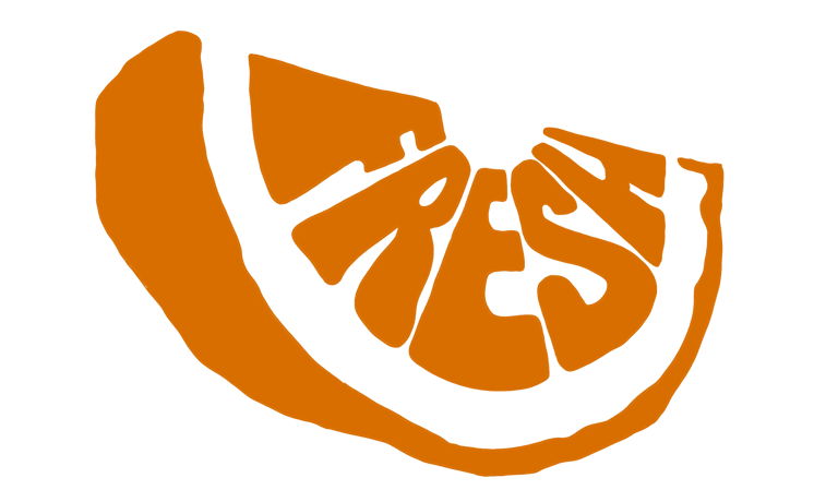
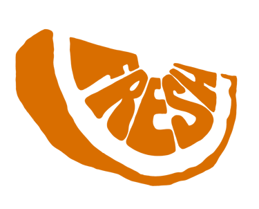
Fresh is a practice logo concept where the typography forms the shape of an orange slice. With its bright orange color and bold, juicy style, the design captures exactly what the name suggests: something vibrant, refreshing, and full of energy.
Fresh (Practice Logo)